Sune TV
shopping experience
Overview
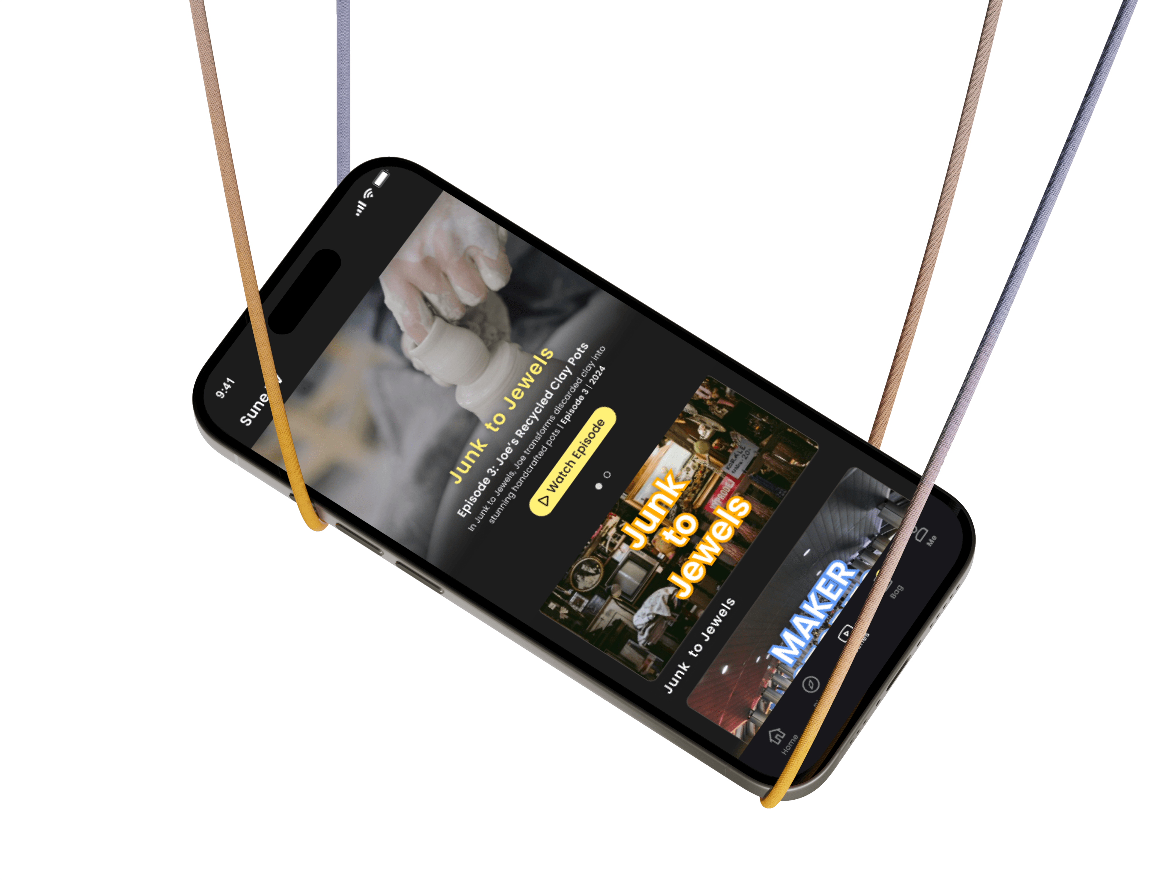
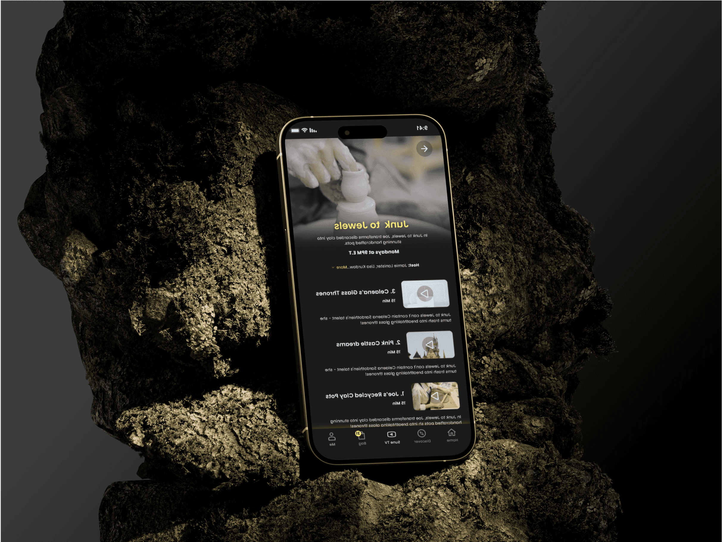
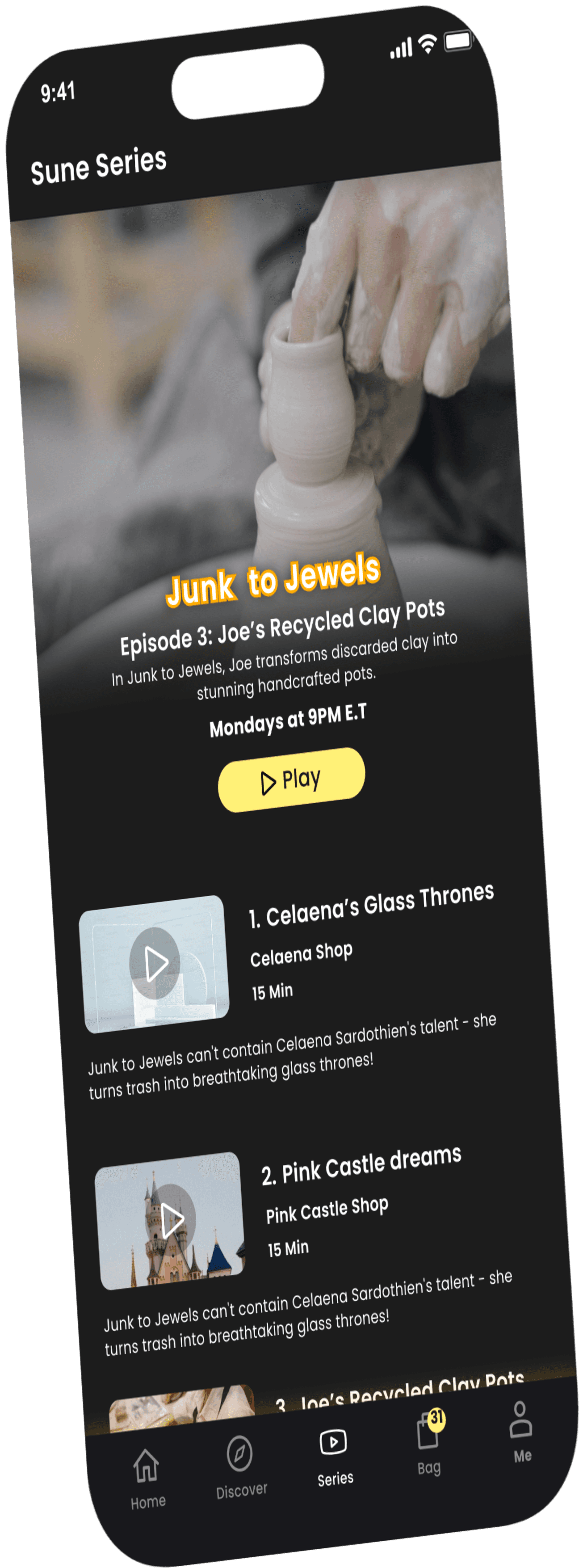
Sune is QVC's online marketplace designed specifically for makers. The shopping experience is centered around short vertical videos created by these makers.
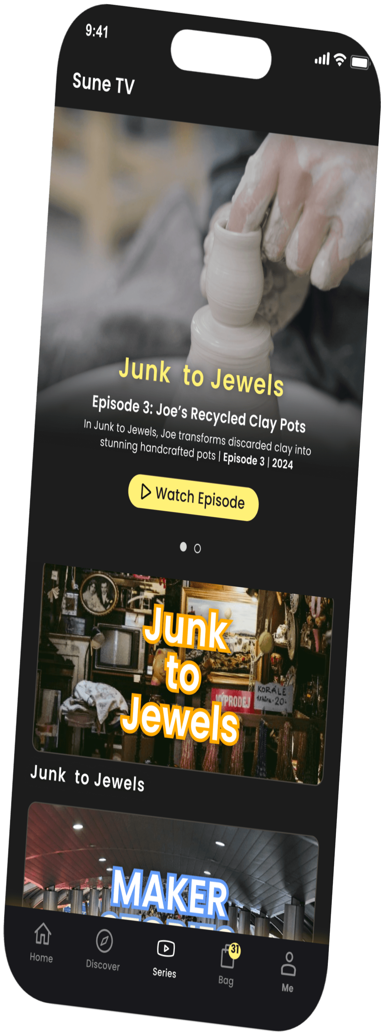
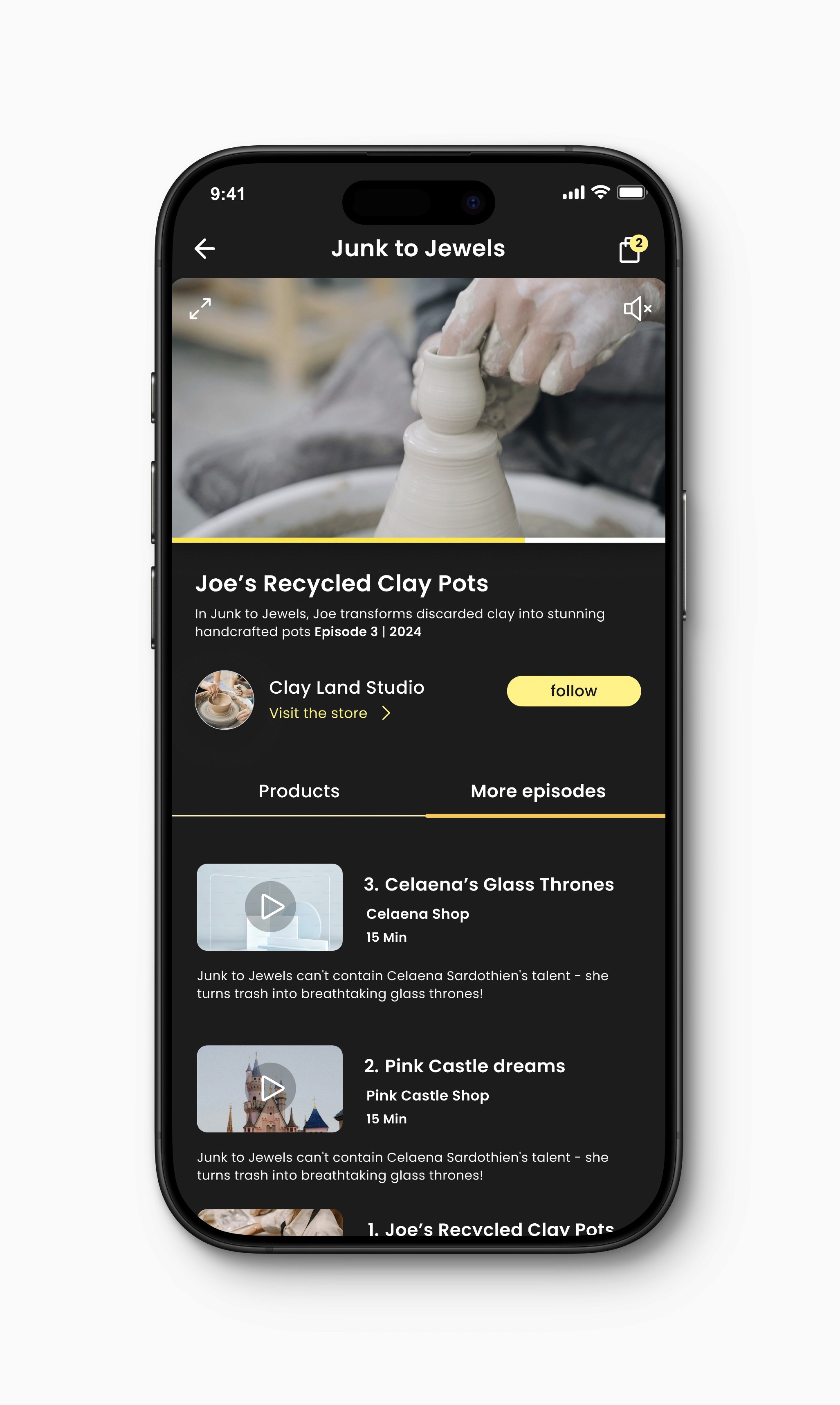
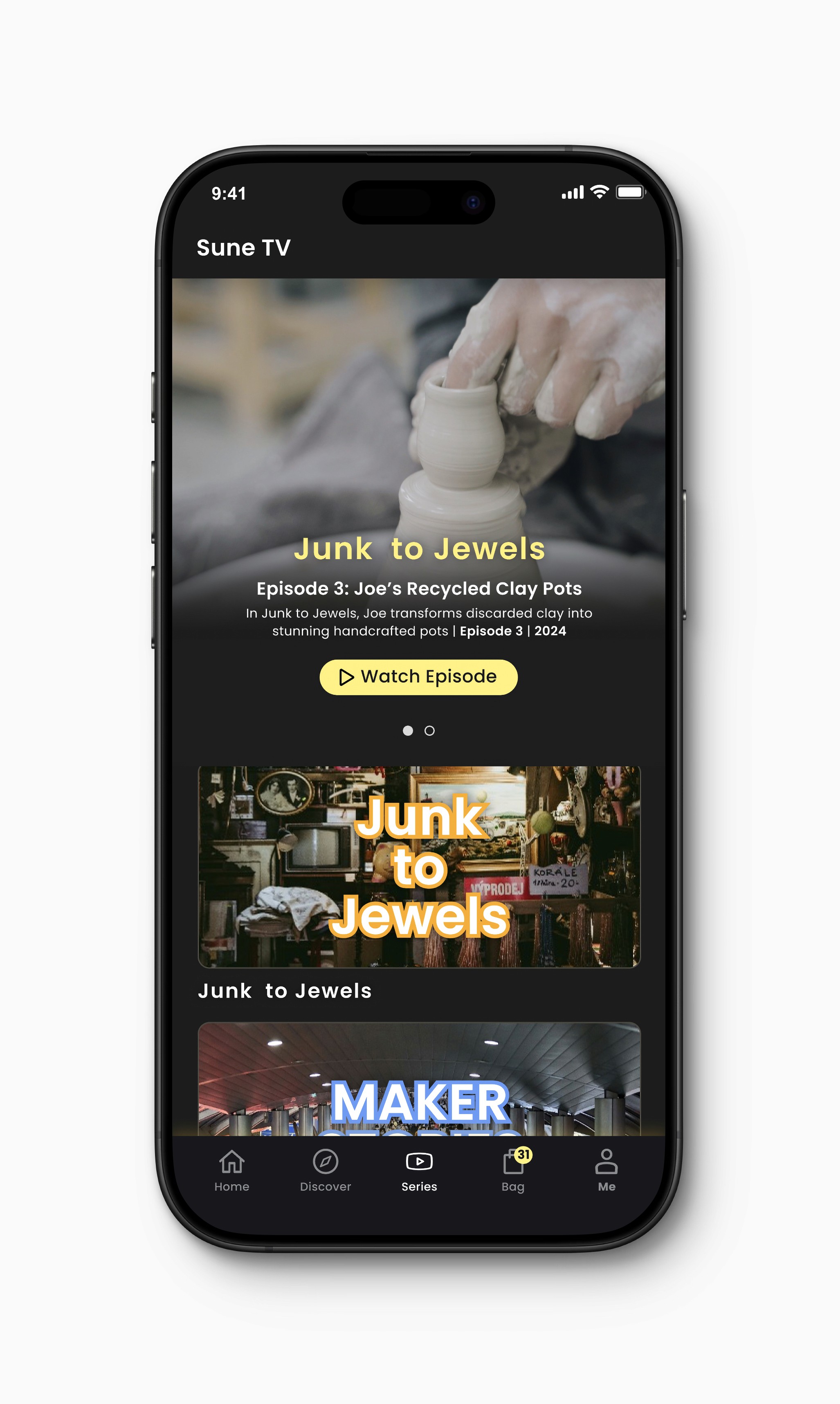
On the other hand, Sune TV is a streaming feature similar to Netflix, where users can watch episodes that showcase various products available for purchase.
In contrast to the other videos in the Sune app, Sune TV episodes are longer, of higher quality, and produced by Sune rather than by the individual makers.
Company
QVC, Sune
My Role
Product Designer
Year
2024
1
2
3
stream
how i made it
makers
junk to jewels
binge
shop
Maker Stories
sune tv
tv + store
shows about makers
all episodes
behind scenes
Our Goals & Objectives
Enhanced shopping experience: Sune sought to create a more engaging and immersive way for customers to discover and purchase handcrafted items.
Personal connection with makers: The platform aimed to highlight the stories and passions of the makers behind the products.
New revenue streams: Sune explored potential revenue opportunities through advertising or premium content.
We conducted a comprehensive competitive analysis to benchmark Sune TV against similar platforms such as MAX, Disney+, Netflix, and Hulu. Key areas of comparison included content format, user experience, and monetization strategies. We found that while there were platforms offering video content related to crafts and hobbies, none had integrated such content directly into an e-commerce experience.
Strengths:
Clean, intuitive interface
Strong brand recognition and user base
Extensive original content library
Strengths:
High-quality original content
Extensive Warner Bros. library
Ad-free experience
Strengths:
Strong focus on Disney, Pixar, Marvel, Star Wars, and National Geographic content
Family-friendly content
Competitive pricing
Strengths:
Offers a mix of original and licensed content
Ad-supported and ad-free tiers
Live TV streaming option
Weaknesses:
Can be overwhelming with the vast number of options
Limited customization options for the homepage
Weaknesses:
Complex navigation and organization
Limited customization options
Recent merger with Discovery+ may cause some initial confusion
Weaknesses:
Limited content outside of Disney's ecosystem
Interface can be basic compared to competitors
Weaknesses:
Interface can feel cluttered, especially when browsing multiple profiles
Ad-supported tier can be disruptive
Overall:
Netflix's UI remains a benchmark for simplicity and ease of use. However, as competition intensifies, the platform could benefit from more personalization features.
Overall:
Max's UI is functional but could be improved with a more intuitive and user-friendly design. The platform's focus on high-quality content and ad-free experience is a major selling point.
Overall:
Disney+'s UI is simple and straightforward, reflecting its target audience. While it may lack the depth of features found on other platforms, its strong content library is a major draw.
Overall:
Hulu's UI is functional but could be improved with a cleaner and more streamlined design. The live TV feature adds value, but the ad-supported experience can be frustrating for some users.
Ideation insights
Brainstorming sessions generated ideas for Sune TV. The team focused on creating a platform to entertain and inspire customers to purchase handcrafted items.
We ideated on the best product, and only after that did we identify the MVP.
Designing for M1 and M2 at the same time
Given the fast-paced nature of the project, the design team created two sets of features: M1 and M2.
M1 focused on a single show, while M2 introduced multiple shows, multiple makers, multiple trailers, and a show host. This approach allowed for flexibility and adaptability as the project progressed.
The design process involved gathering requirements, creating sketches, and developing prototypes. The team focused on creating a user-friendly interface that seamlessly integrated video content with the existing Sune platform. Key design elements included a visually appealing layout, intuitive navigation, and a strong brand identity.
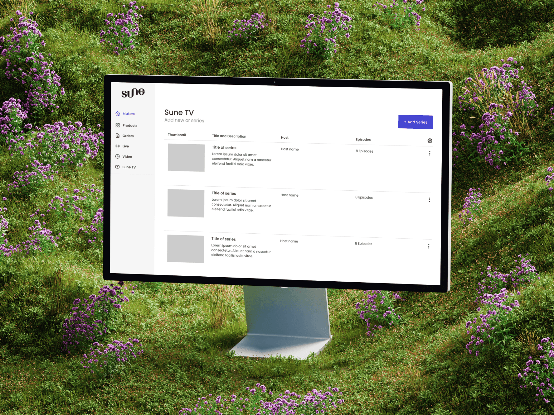
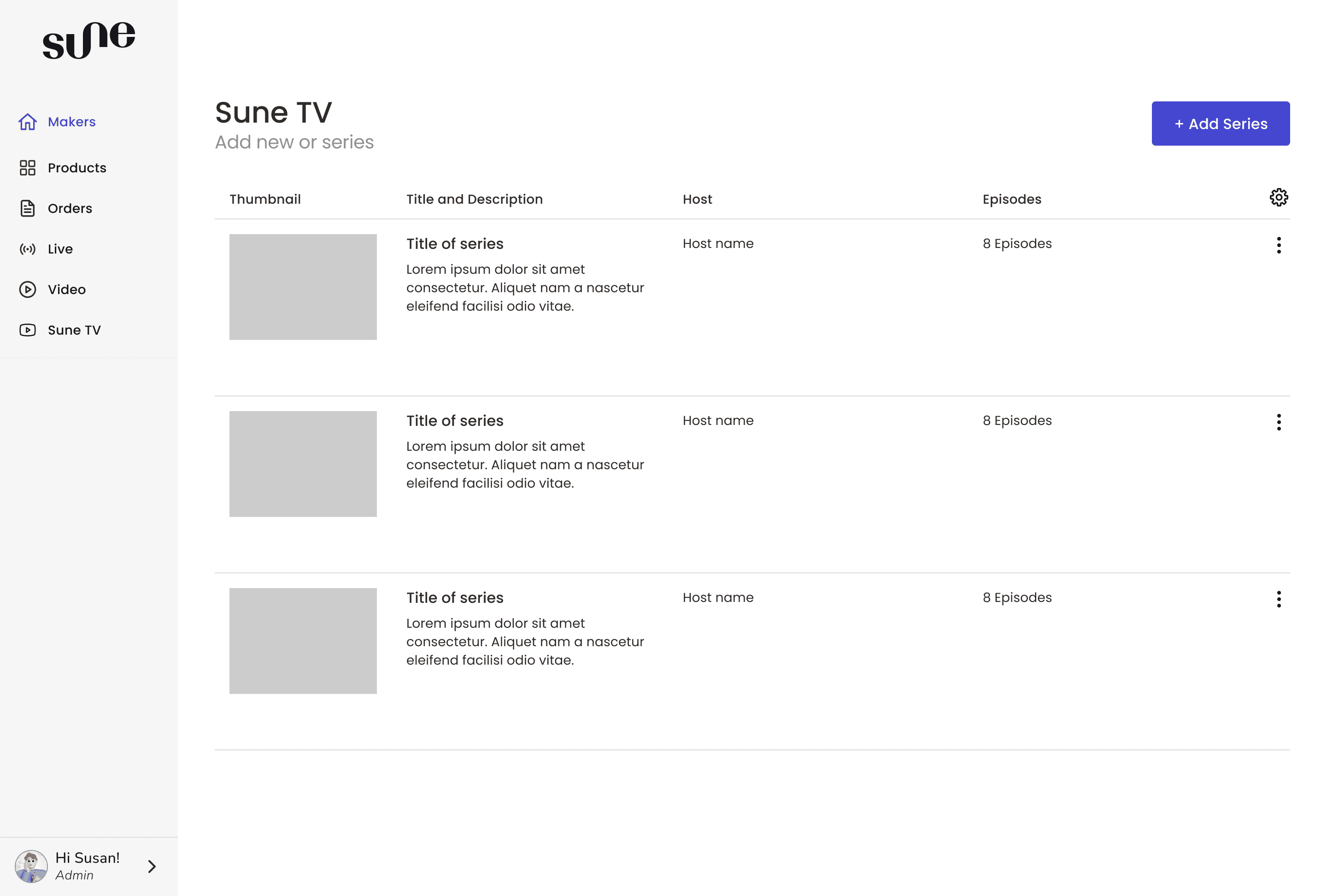
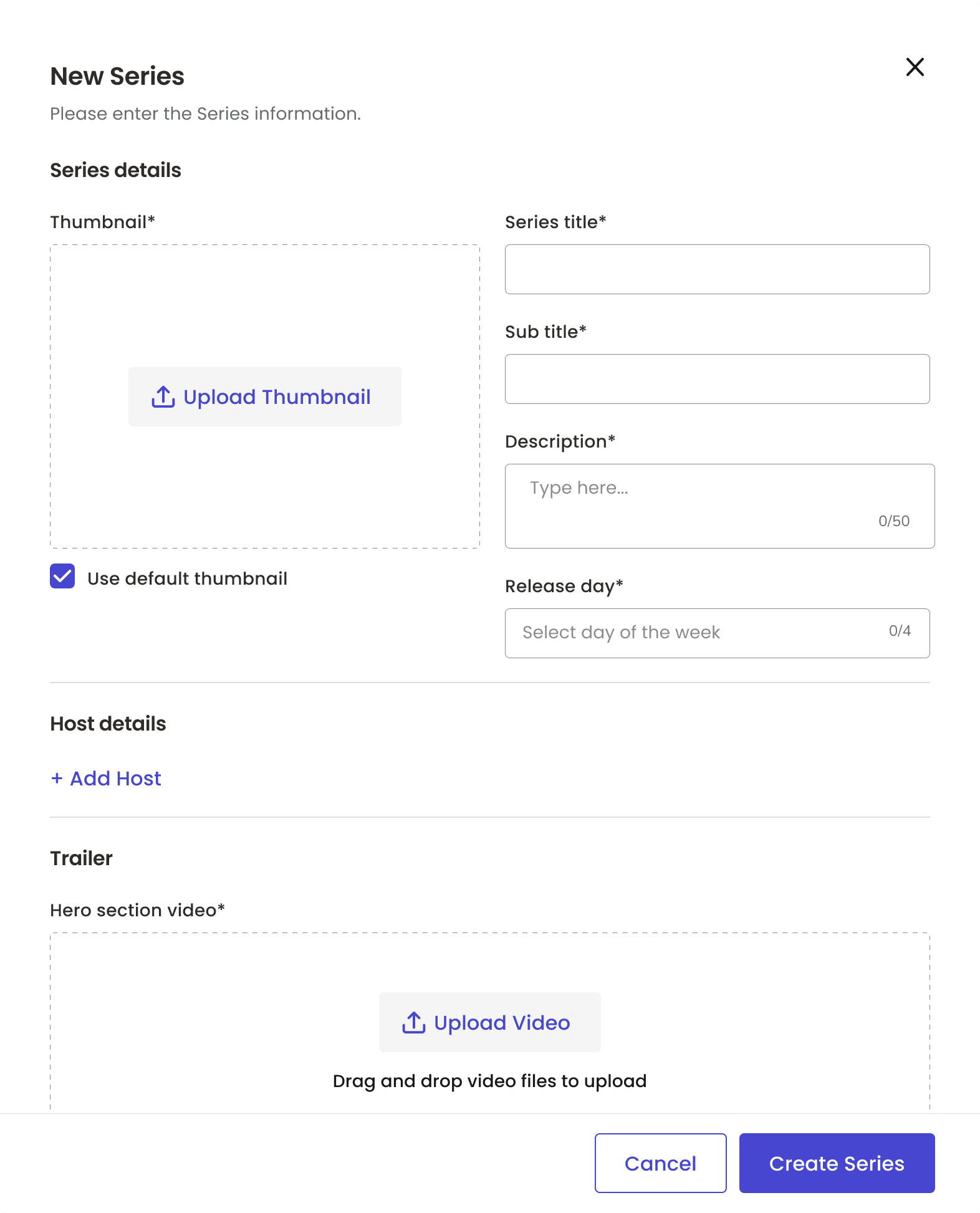
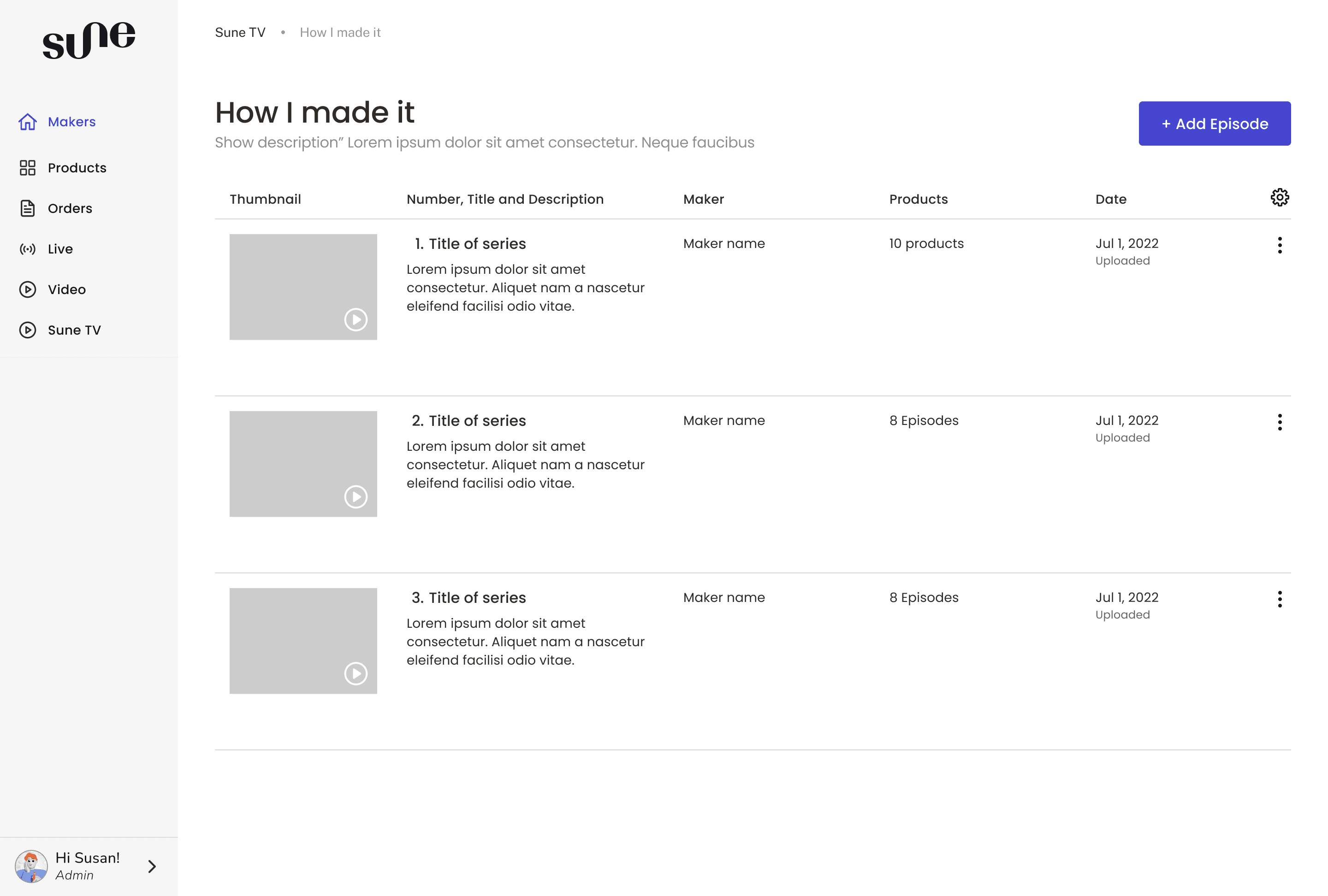
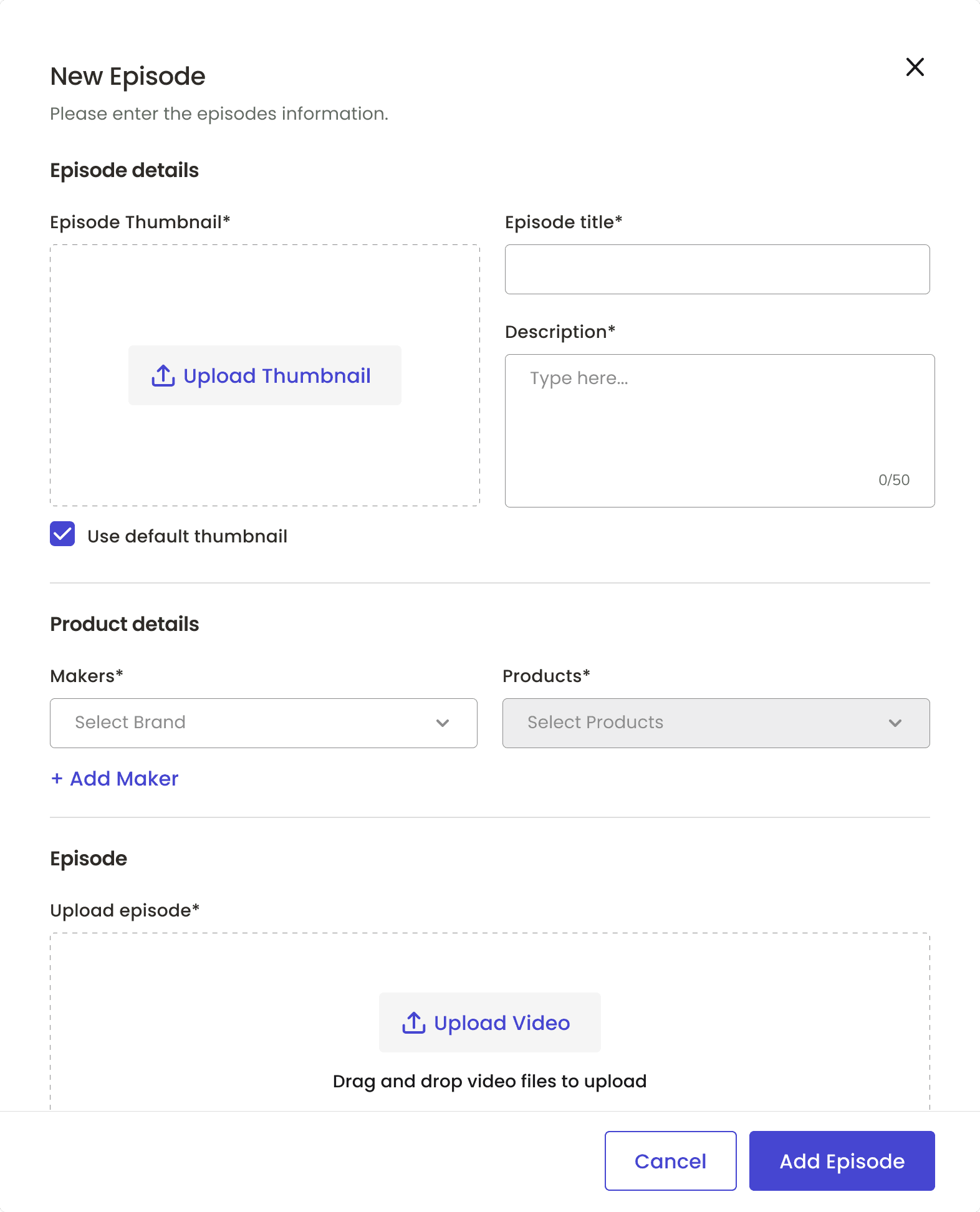
In addition to the in-app experience, the design team developed an administrative backend on our web platform to enable content management, scheduling, and analytics. The admin profile was designed to be user-friendly and efficient, allowing administrators to easily manage and update content.
M1 Designs and Featueres
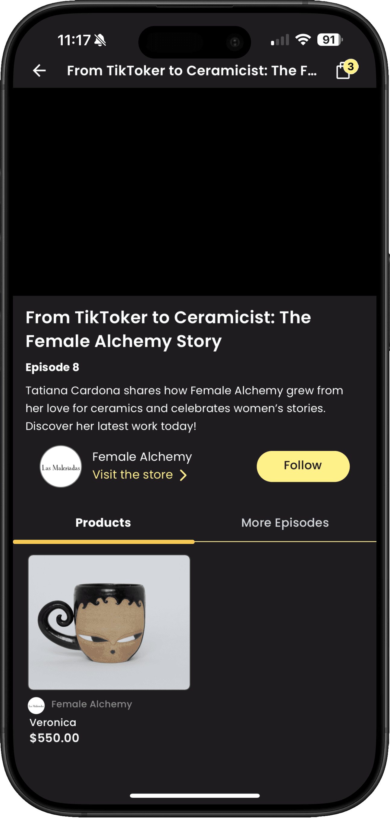
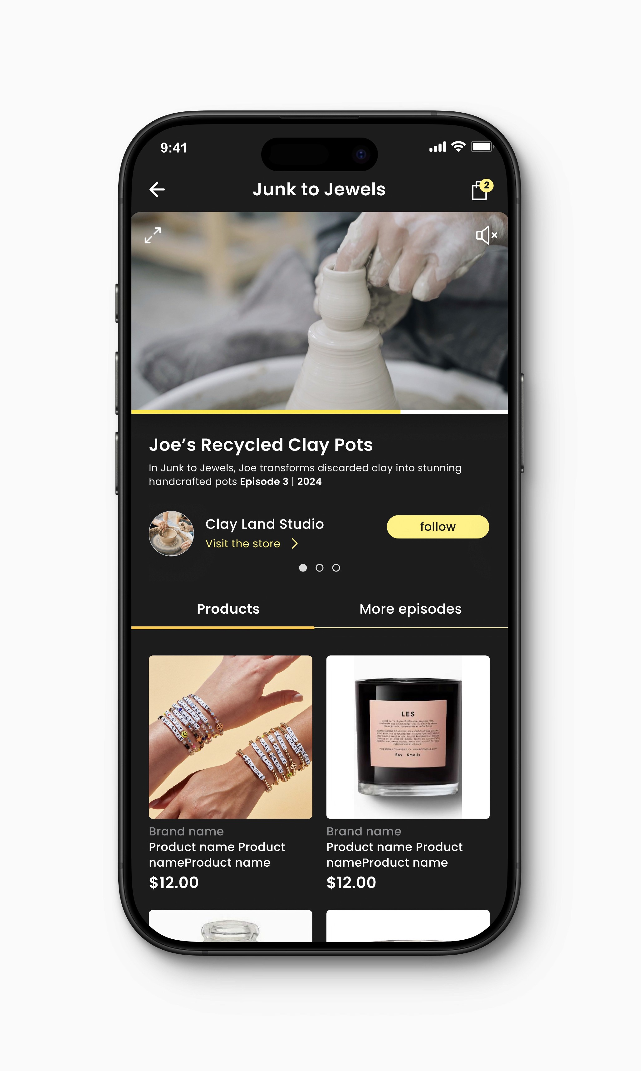
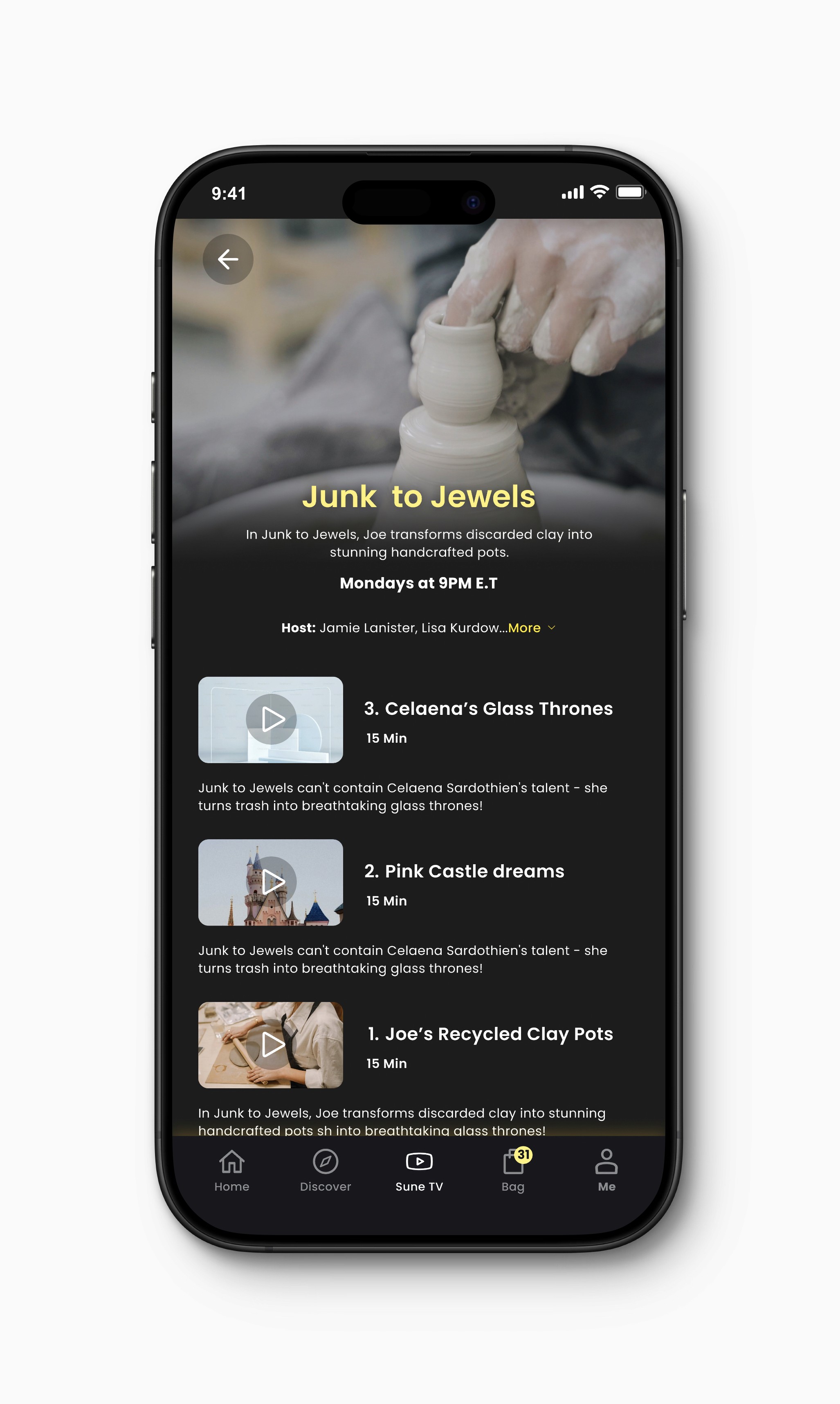
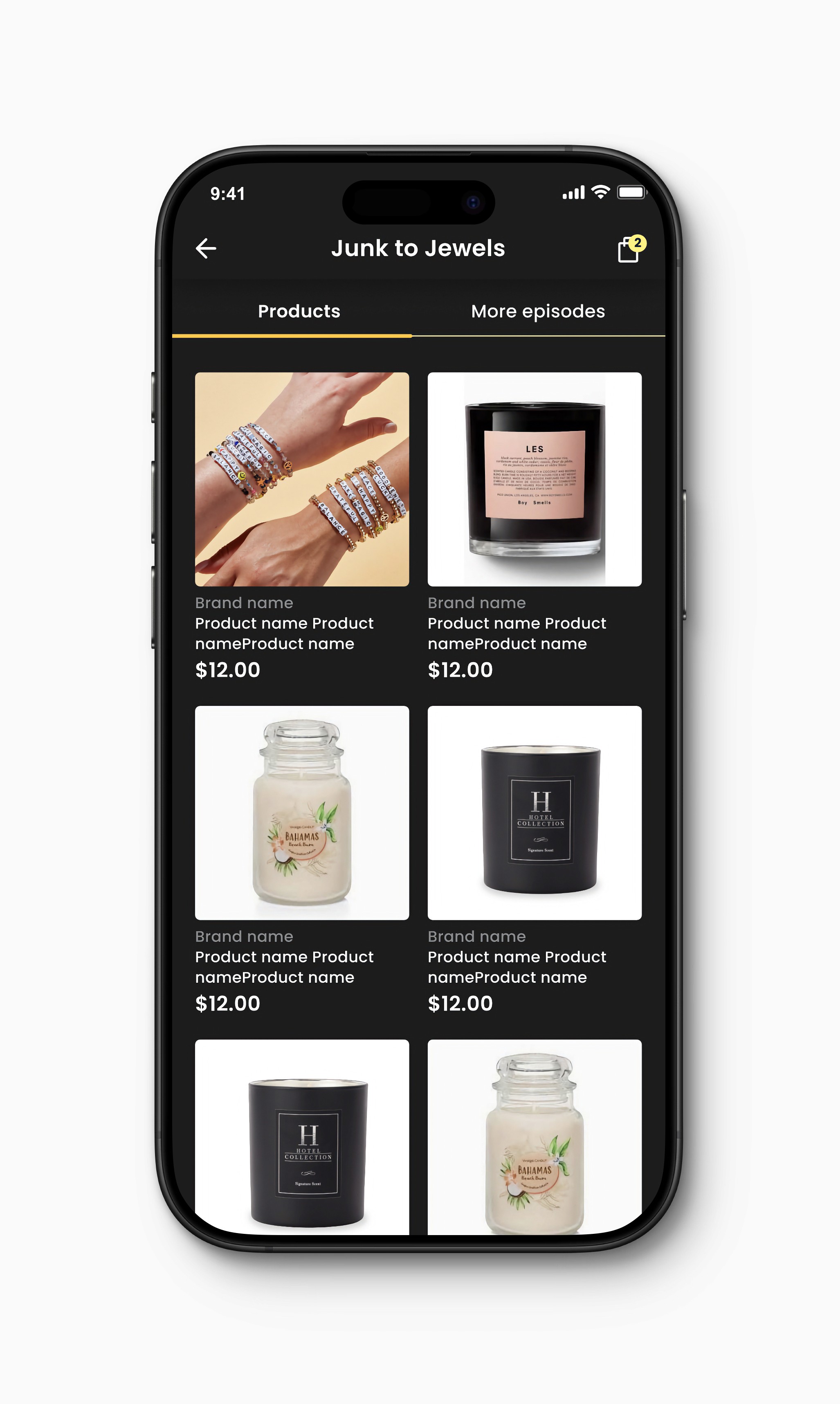
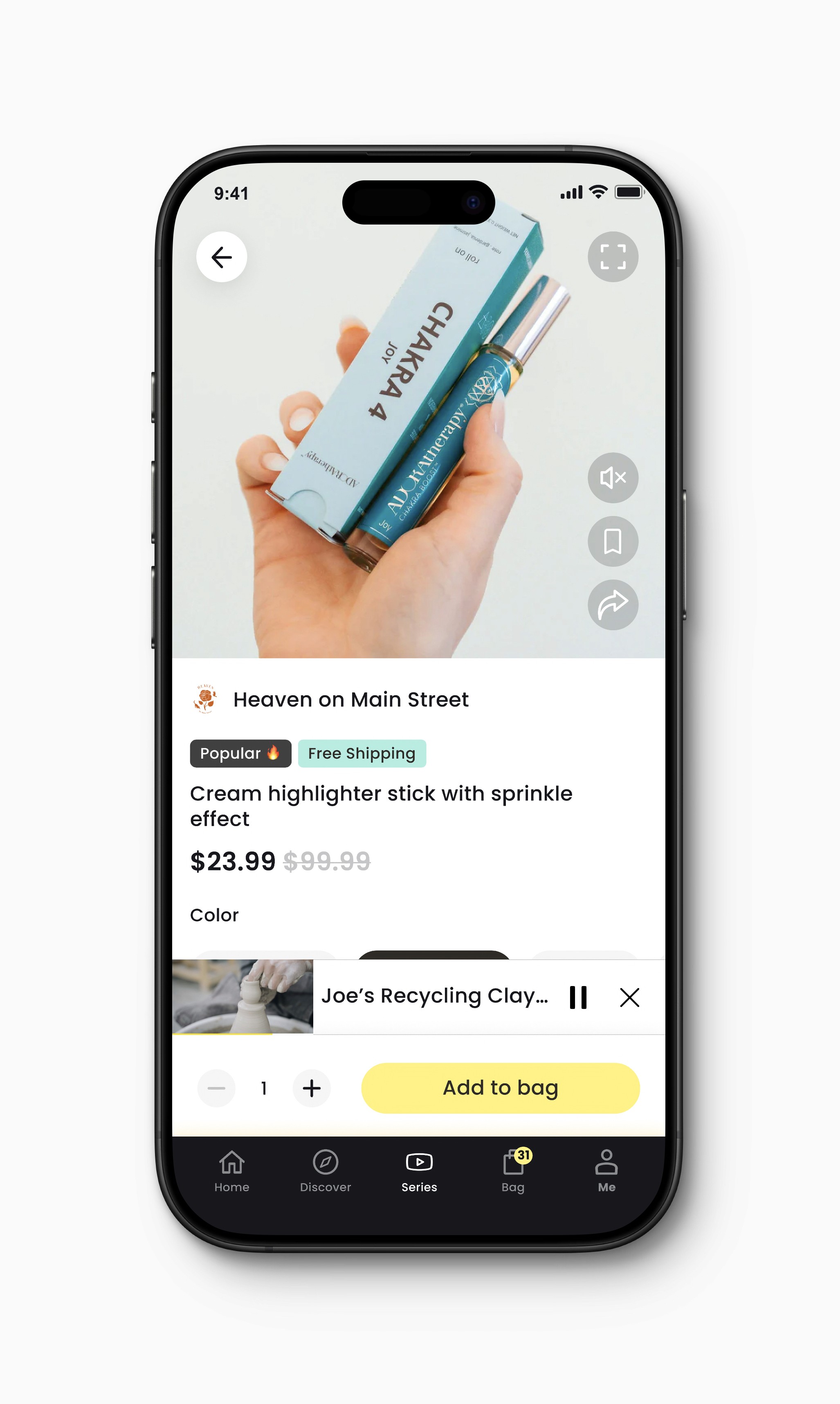
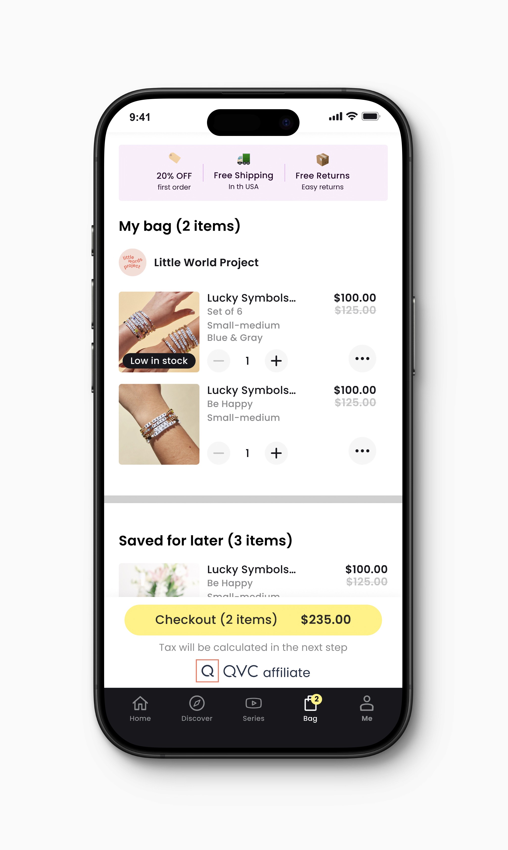
Sune TV M1 allowed our users to browse through the episodes of our original show and shop products.
Since Sune TV was a new experience, we assigned it a dedicated tab in our app.
For the most immersive experience, users can watch episodes in full-screen mode.
Multiple
New show level page.
Multiple
With relevant products.
Multiple
Both for shows and episodes.
Multiple
For each show or episode.
Final Designs
We handed off M2 designs and started thinking about M3
Admin Features
All information flows from the admin profile to the Sune TV tab.
Results
Adding Sune TV to our app has gradually resulted in increased retention and conversion rates.
Although it has only been a few months since Sune TV shows were launched, they now account for X % of the total video watch time. Between September and December, retention rates increased by X %.
We are still monitoring the conversion rates, which will be announced soon.
Summary
Working on Sune TV provided an excellent opportunity to collaborate with various teams to create something extraordinary.
It was a reminder that greatness often comes from teamwork.
Copyright © Giorgi Okhanashvili, 2023. All Rights Reserved.
